Category Archives: design

Citrus Sport Illustrations – Journal Design Concept

I thoroughly enjoyed my latest project to design a journal concept. I developed the ‘Joynal’ concept – a lovely book in which to note and track fun times, and joyful days.

The Brief

The starting point for the brief was a citrus and candy colour palette which we were then asked to develop into a journal concept. The brief was from Lilla Roger’s Make Art That Sells (MATS) Bootcamp for illustrators. I study with MATS as I can feel progression in my work during the course of a project.

My colour palette design created from the colour prompts provided

My ‘Joynal’ Journal Concept

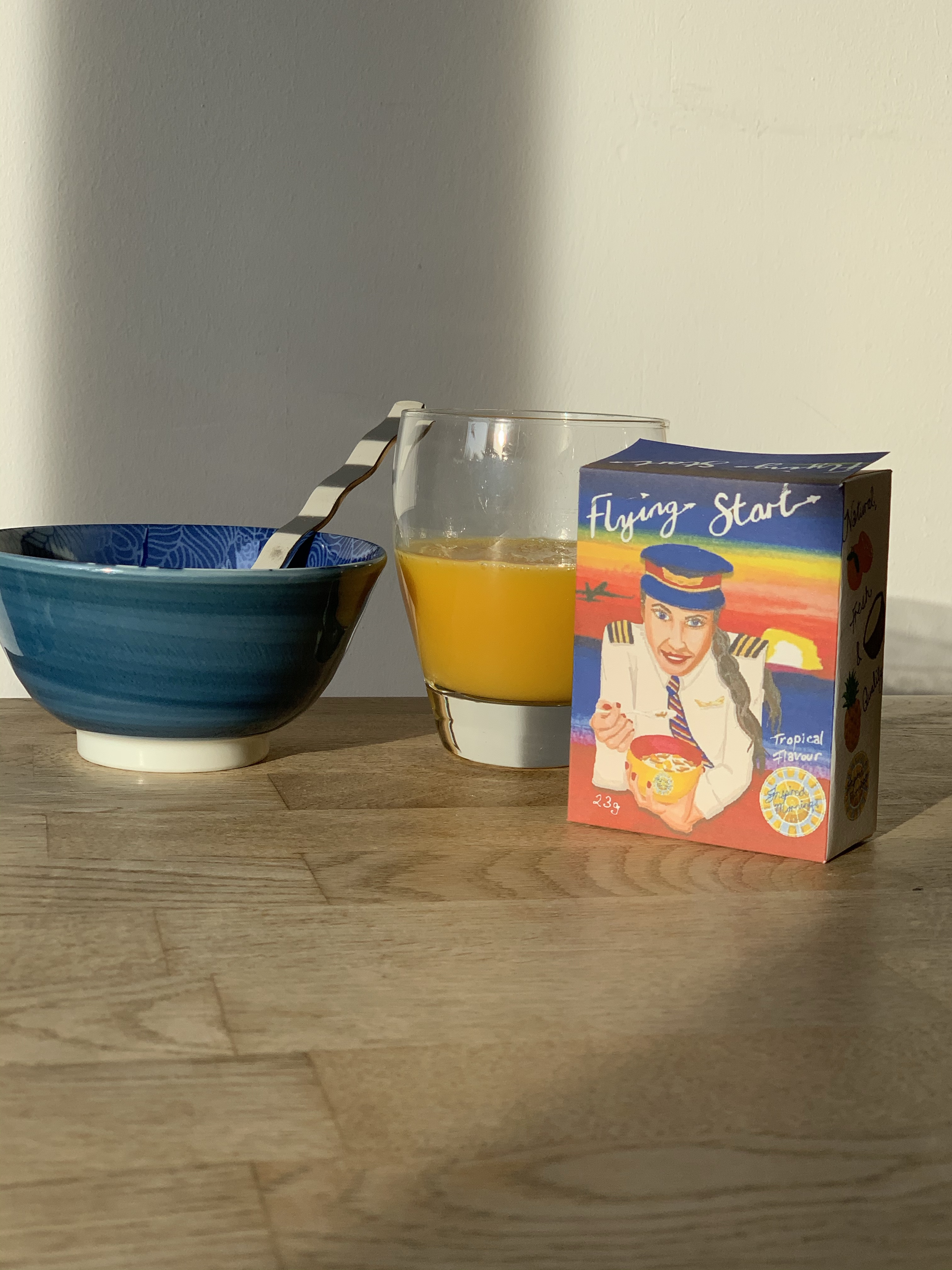
Here’s my final journal design, inspired by Lilla’s advice to “create a journal you would love to own”. The journal design features fabulous female characters enjoying favourite activities and sports; with the citrus concept running throughout in the form of orange, lime, grapefruit and citrus flower iconography.

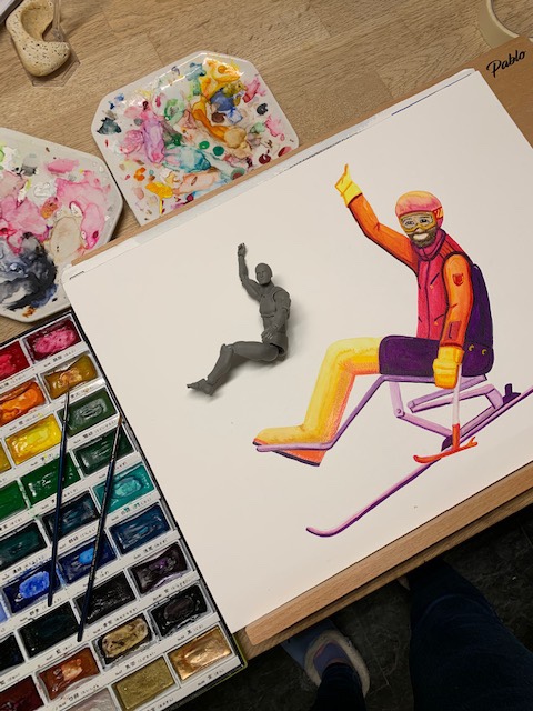
I’ve been creating many ski illustrations in recent months, so I’ve been keen to explore illustrating other sports, and this was a great opportunity to do so.

The idea of skiing through fallen citrus blossom is just blissful, and I’m looking forward to getting back to tennis and swimming after this lockdown. Cycling is presently a great escape from the routine of home; the countryside and big open skies are so refreshing.

My Journal Design Concept – Available for License at the time of publishing

The journal pages will be unlined coloured paper which can take some watercolour painting. To accompany the book design is a wipe-clean bookmark concept on which to write intentions, goals, or a bucket list; with a pretty, colour coordinating, tassel. The journal concept includes a dry-wipe glitter pen and citrus heart paperclips.

Things To Spot

Favourite elements to spot are the sea turtle, stingray, embroidered mountains, grapefruit sun lounger, the orange slice bike wheels, and the pink grapefruit heart motif.

How It Was Created

It was fun to explore for the brief, and I was very at home with the colour palette as it has a number of my favourite hues.

Watercolour icons and hand lettering

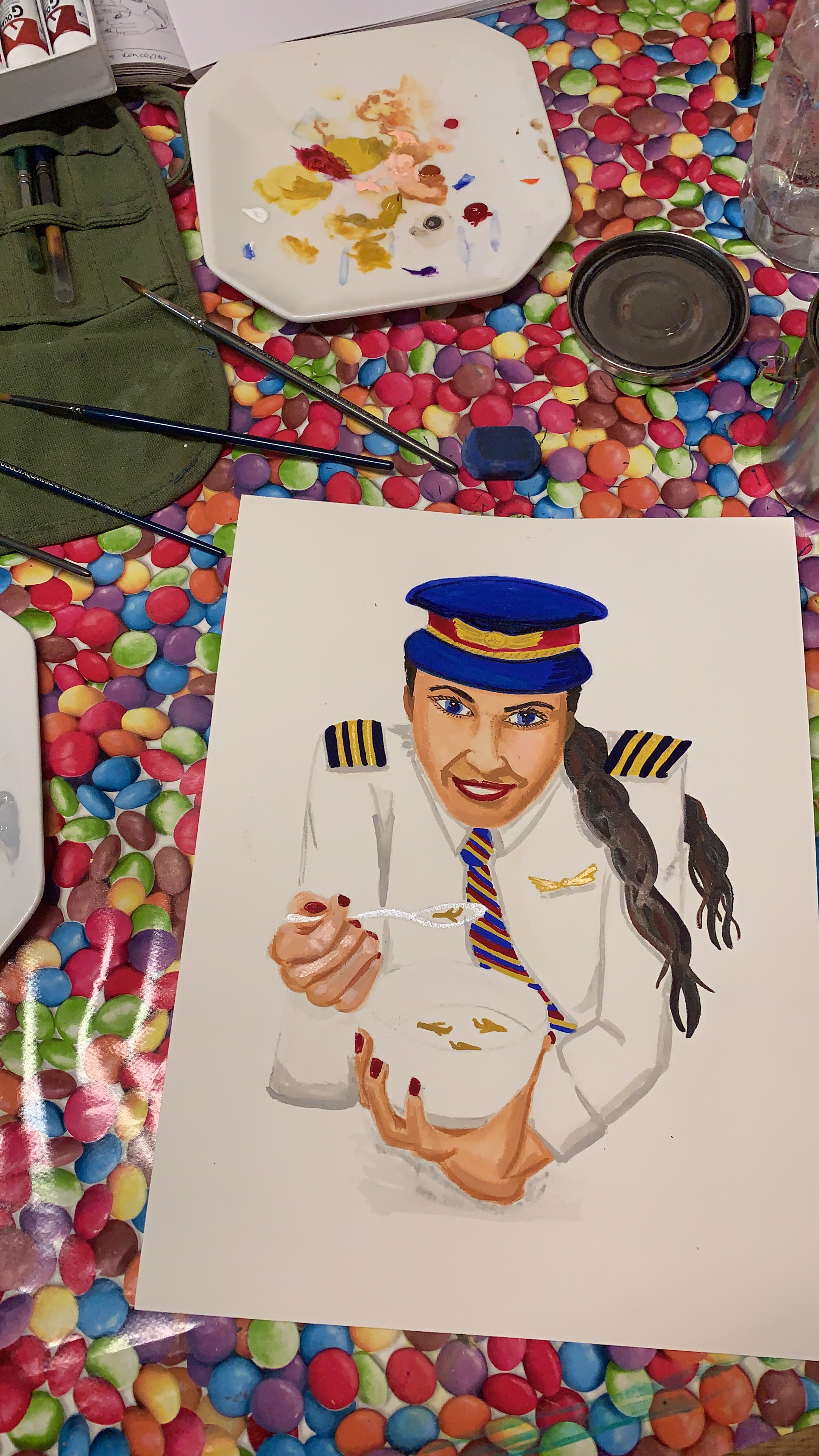
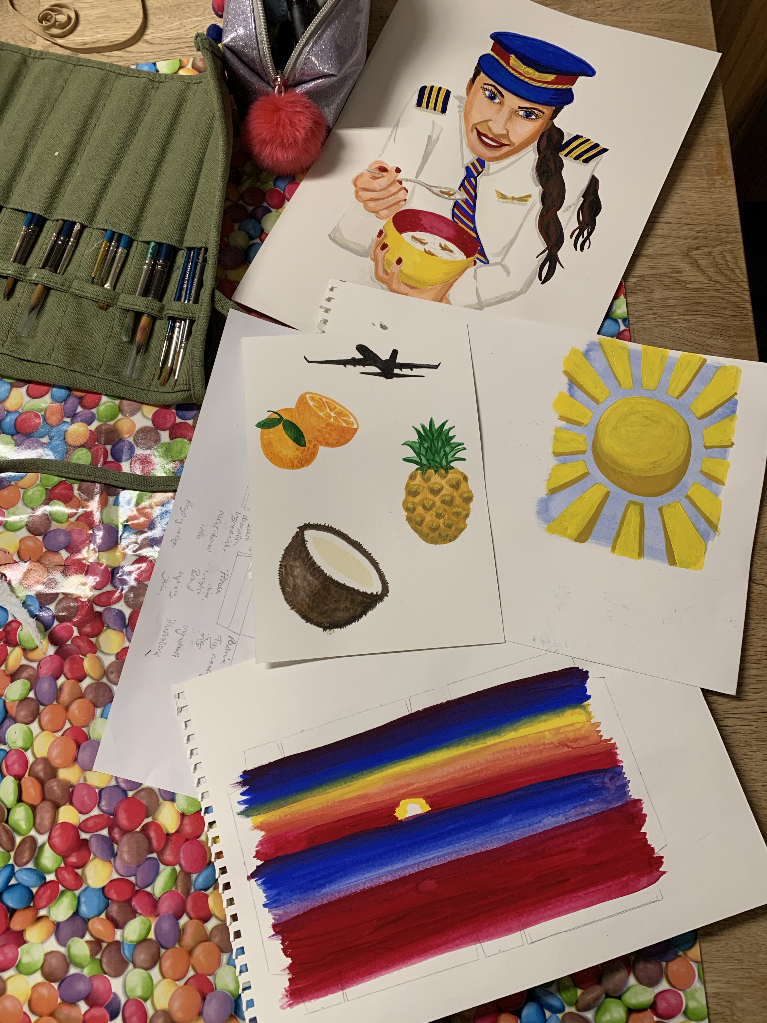
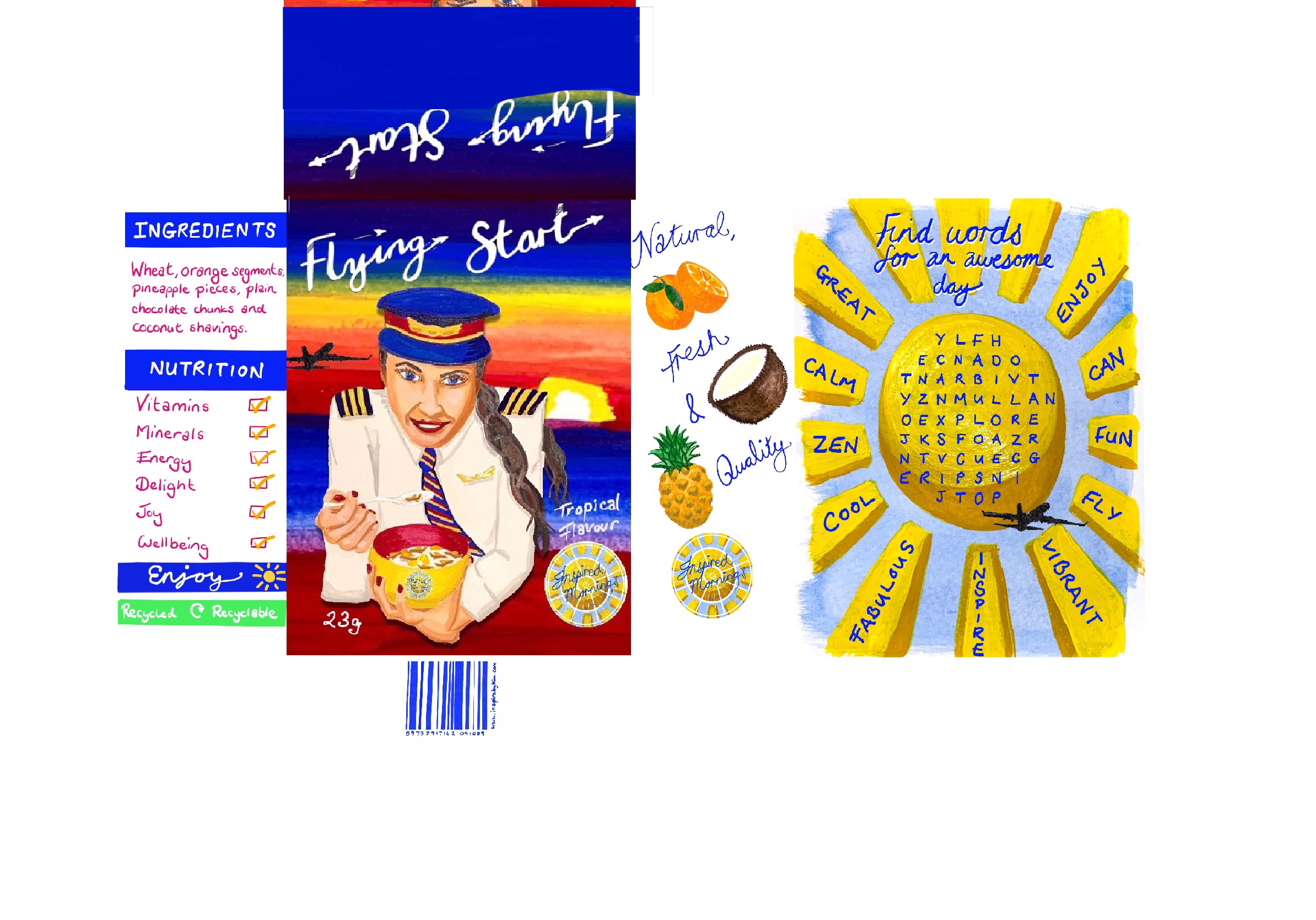
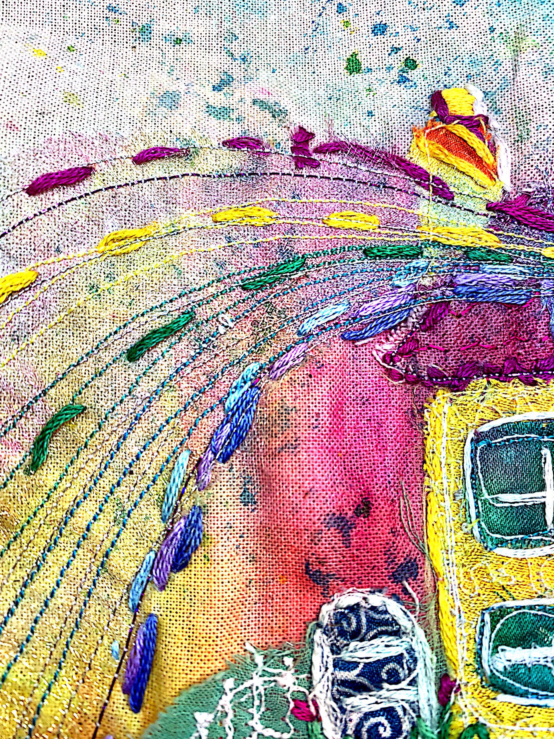
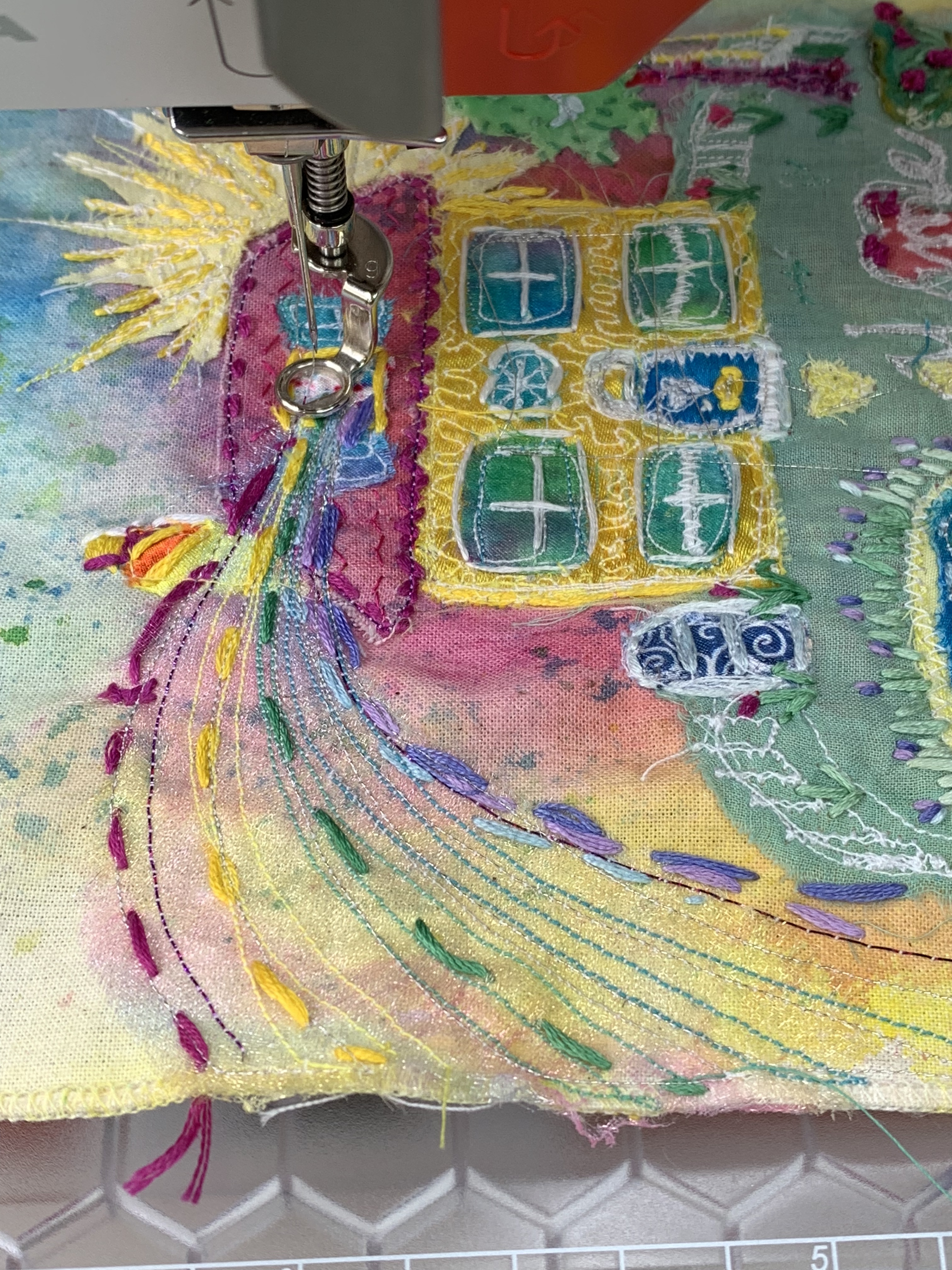
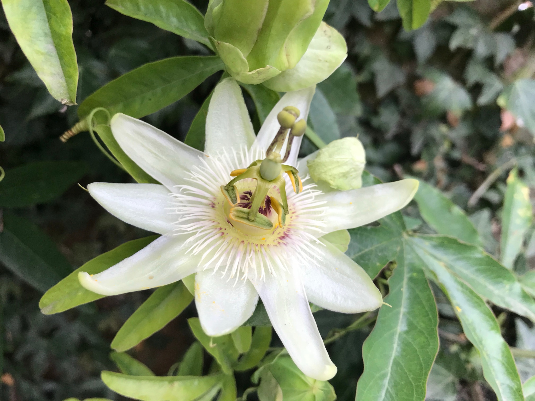
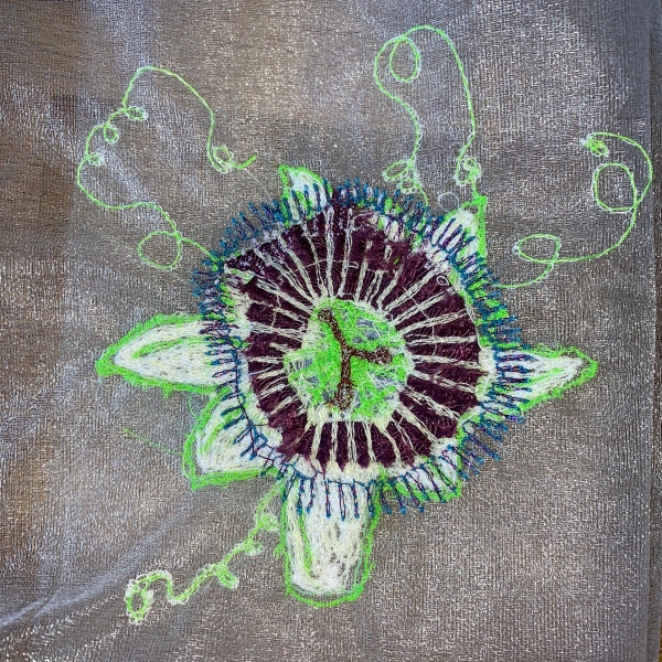
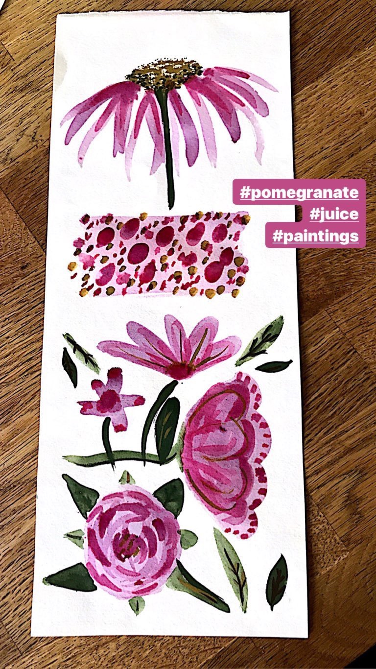
The illustrations were created in watercolours, free-motion embroidery on textiles that I have previously dyed/printed, and digital drawing in Procreate. Compositions were worked out on rough sketches.

The hand lettered journal and bookmark titles were created in watercolours and are embellished in the lace effect pieces that I created on my trusty Bernina sewing machine.

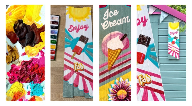
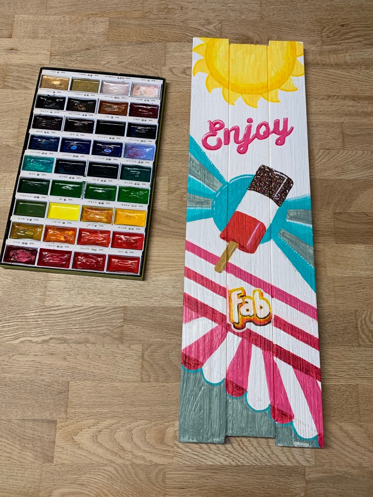
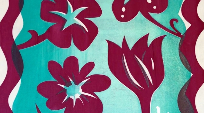
Additional Citrus Themed Outcomes

During the course of the project I created these two zesty refreshing citrus themed pieces. They remind me of hot sunny days, holidays and beach resorts (UK and overseas).

Citrus Ice Lolly Spot Illustration
Citrus and Candy Cocktail Spot Illustration

Products and Tools

These were those used in the project and which I am happy to recommend:

Kuretake Watercolours, Dr Ph Martin’s Liquid Watercolours, Arches Cold Pressed 300gsm Watercolour Paper, Colourcraft Transfer Paints, Bernina sewing machine, and Procreate app on the iPad Pro and Apple Pencil.

And finally

I really enjoyed the journal brief, citrus prompt and colour palette. Thanks so much for a great brief Lilla. If you’d like to see all the Journal designs created in response to this brief you can see them at this link…

If you’d like bespoke art or illustrations, or to license existing work please email me at inspirebykim@outlook.com

Thanks so much for being here. Please share with friends who’ll enjoy these illustrations.

Have a zesty, zingy day with plenty of what you love

Love and luck

Kim

Latest Projects

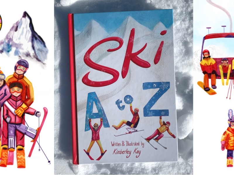
New Book Is A Gift For Families And The Ski Curious

I wrote this article for my new website but didn’t want my subscribers not to see this. Please see the article then come across to my new website, to continue to follow the fun. This website will be disappearing shortly and I don’t want to lose you. New website at http://www.inspirebykim.com New book Ski A…

Come Across To My New Website

Thank you for your support, come across to my new website. Subscribe to continue to receive notifications and news, and illustration tips as they arise

Ski A-Z Cover Design

I’m delighted to share that I’ve completed the Ski A-Z book cover design which I’ve been developing over the past month.

The Cover Design

It’s a bright, bold design with three cover stars supporting the title letters in a mountain setting, The book will appeal to both those wanting to find out more about the sport, and to seasoned skiers.

Here’s the cover mocked up on a coffee table setting with ski themed props to bring the book concept to life. Notice the ceramic snowflake as a coaster for the edelweiss coffee cup.

The Book Concept

The Ski A-Z book concept – a practical, informative, fun, illustrated glossary of skiing with hints, tips and advice.

It’s the kind of book that you’d recommend to the friend that wants to get into skiing, it’s a gift for a ski lover, it’s a conversation starter for an evening in the chalet during your holiday.

The Design Process

I created the background and skiing characters in watercolours and ink, used a glue gun to give the letters texture and composed it digitally in Procreate.

My mini model Bruce posing for this character’s painting.

I had an idea to animate some of the book characters ‘excited to meet the readers’ to demonstrate the energy of the book.

Watch This Space…

Watch this website, my Instagram or Facebook page for updates on the project.

Here are posts about my latest work. Thanks so much for following my blog. Please feel free to share it with friends and colleagues who will enjoy it.

Enjoy!

Kim

Ice-Cream and Fab Lolly Sign Designs

I’ve created some garden sign designs of ice-cream and ice lolly nostalgic summertime themes.

Ice-Cream painted sign. The wonderful, iconic 99 ice-cream, here in a tasty wafer cone, with chocolate at the end. 😋 Poster design to enhance the garden shed.
Adding some fun summer icons.

The second design, with the same colour palette, again in acrylic paints was themed on the Fab ice lolly.

Nice weather meant it was possible to get outside and paint.

Have a Fab day! Fab ice lolly themed poster art. Enjoyed painting this piece. Please scroll sideways to see the work.
Research was fun, and tasty 😋. The fab lolly is a product which is still going strong after more than 50 years!

Here is a related post…

Hot Days Eating Cool Ice-Cream

Here are my latest posts.

Thanks for being here. Please take a look at the work. You might want to check out my portfolio or might have an need for a bespoke artwork.

Bye for now.

Kim

Happy Christmas Illustration

Wishing you a Happy Christmas.

I created this design as an online and offline greeting. A still illustration with photographic and digital art, and also a gif with flashing fairy lights.

The design swops Santa’s sleigh for a sports car based on my favourite car design. I originally made the car in cut paper for this ‘Going to the Seaside’ Paperart piece.

Santa is joined by a little white dog, who is enjoying the ride, and a small festive robin.

The little white dog features in that artwork and those who’ve been following my work will know is the character Sam, who I’ve also painted for the Children’s book – The Dog Who Wanted To Fly

Sam – Copyright Kim

I chad created the Santa for commercial Christmas illustration I was also working on…

Using the design I created a limited print run of just 10 Christmas cards. Then my printer stopped working.

I added sparkly details with gel glitter pens and sent the fleet of greetings to family and close friends.

I next went on to bake this design in Gingerbread. See this story here…

Click on the image to see the gingerbread version of this design…

Once created I felt that the robin on the picture needed to ice skate. So I added skates and made an animated gif. A little winter sport fun for my favourite festive bird.

Wishing everyone a Happy Christmas. Thank you so much for the support and to everyone who has read, Liked and Shared my work. It means so much.

Please Like and Share this post, if you wish to. I’m keen to reach as many people as possible to brighten their Christmas.

Thanks so much.

Kim x

Here are related posts:

Christmas Commercial Illustrations

Gingerbread Adventures

Latest Illustrations

September Reflection and October Direction

Paperart Originals – Ready for a new home

Free Download – Christmas Card Design

Breakfast Cereal Design Concept

Great days start with great mornings so I wanted to create a positive, inspiring breakfast cereal in response to the brief: Create a fun sized design concept and packaging for a new cereal product.

I wanted to inspire and uplift women through a positive, confident image of a female pilot. She already has three stripes so she’s doing well; metaphorically and literally she is flying high.

Here are my rough drawings whilst brainstorming ideas for the box creative…

Pilot eating breakfast, sketch
My favourite concept from all the ideas (below)

The character was further inspired by the aviation PR work I’ve been busy enjoying in recent weeks, thanks to my client in Florida.

Female pilot

I thought that aeroplane shaped breakfast cereal would be fun and novel. This idea was warmly received in consumer testing, with enthusiastic feedback.

I later added the fruit, and additional cereal aircraft, into the bowl for the final iteration.

Once I had the character idea I felt the breakfast cereal design concept formed around her.

In order to create the entire packaging concept it was necessary to define the target market, and what would appeal to them, to decide the ingredients, flavours, also to create a cereal brand, logo and product name.

I had all this in mind when choosing the colour palette of gold, red wine and cobalt blue. These were colours I could use throughout to represent the morning sun, and the colourful sunrise sky.

I chose ‘Inspired Mornings’ for the cereal company brand, and after painting a sun in watercolours I recreated the round window effect of my ‘Inspire by Kim’ logo and added the new brand name.

Nutrition and natural ingredients are key to wellbeing, which is fuel for a positive frame of mind, so I wanted the flavours and sweetness to be natural, therefore I chose fruit flavours on a Tropical theme, This flavour choice was to evoke the idea that the pilot is flying to a tropical island destination.

Travel, new experiences and the relaxation enjoyed on holiday/ vacation are fundamental to enjoyment of life, so by bringing flavours that are associated with holidays into the cereal concept the consumer would start the day enjoying a breakfast that the brain can associate with positive, pleasant experiences and help the person benefit from the associated holiday feelgood factor.

Watercolour painted pineapple, oranges and coconut

By illustrating the ingredients it was possible to give the consumer quick visual references and these were to denote the fresh, healthy, natural qualities of the product and brand values.

The reverse side of the cereal box was a great fun opportunity to further inspire the consumer and providing positive affirmations to start the day, in the form of a circular word search.

The wordsearch was placed over the watercolour sun using my favourite digital application of present, Procreate.

I created a template to fit the sizes in the brief, 4×3 inches, and arranged the completed panels within this.

The cereal box design before assembly

This was the completed concept.

I was delighted that as I completed the design I saw the Virgin Atlantic campaign to inspire young women with a day of activity using the hasttag #seeherfly Wonderful that this timing coincided with my design.

Have a flying start to a great day. 🛫

Here’s my recent work along similar lines…

Bali Parasol – Instructional Illustration Work

Tennis Club Promotional Work Highlights

Bottle Brand Design

Brand Art – Steel Company

Get in touch for inspiring communications for your project.

Textile Art РAppliqu̩ Embroidered Illustrations

Home – where we are safe to restore and recharge.

Textile illustration in fabrics that I have dyed, painted and printed. Hand and machine stitch. Appliqué art.

Scroll to see the development of the work right back to dyeing the sun fabric with crocus flowers grown in our garden.

Tulips line the garden and colour and energy radiate from the creative studio at the top of the house.

The images show how the project developed.

#textileart #home #house #design #textileillustration #illustration #sew #embroider #stitch #berninauk #garden #rainbow #creative #artistsofinstagram #sewersofinstagram #sheffield #dye #ink #draw #creativeprocess #lancashireartist

Tiny lavender bouquet brought by bluebird, delivering relaxation and sweet slumbers.

Textile illustration using hand and machine stitch with appliqué.

First sketched as part of the #illustrationworkshop process before being made in paper, then fabric.

Inspired by the lavender at #dawnirelandtextileartist group

Poppy stages embroidery inspired by our morning walk.

Saw this pretty poppy on our walk yesterday morning so I decided that it would be my subject for an appliqué embroidery. It’s not quite finished, a little hand sewing to follow, please pop back to see the completed work.

Created at @dawnirelandtextileartist workshop at #stitchedupandfleeced

Other work which relates to this is:

Fabric Design Highlights

Passion for Textile Flowers

Embroidered Dog Portrait

Tennis Club Illustration and Design Work

I’ve been on the ball with designs for a local tennis club. After determining and drafting key messages for the club I developed a number of artworks to encourage new members onto the courts through poster designs, and visuals and a video for social media. image 78img_5654

The new posters in situ by the tennis courts.

image 93

Member testimonials for social media to give a player perspective.

img_5694
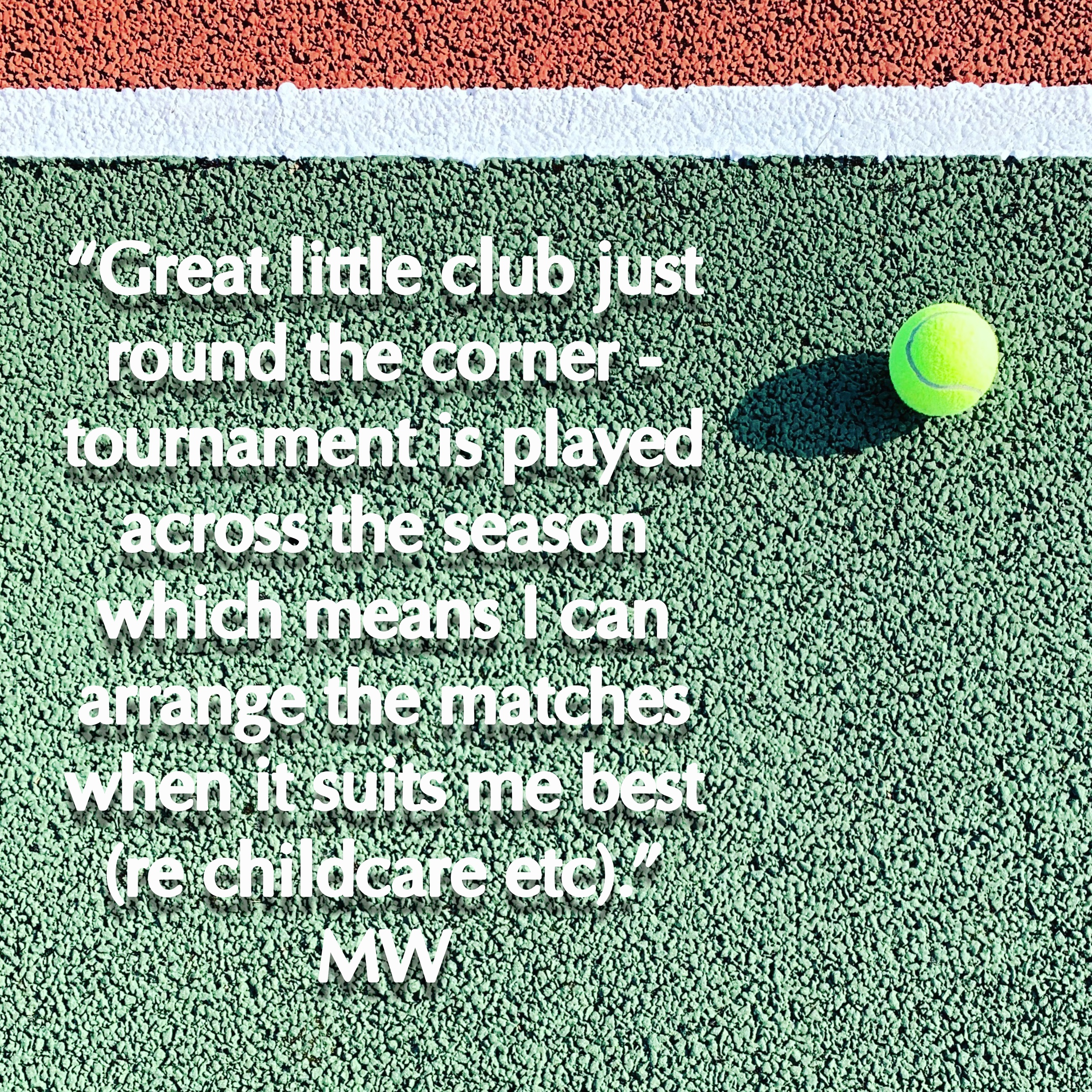
I used this tennis ball and changed the colours to create a junior coaching poster….

image 90

Helped update the website with the new info at Ridgeway Tennis Club.

The posters look great on the club noticeboards.

These are related posts featuring similar projects…

Steel Brand Work

Bali Parasol – Instructional Illustration Work

Football Commissioned Artwork

Bell Pepper Allergy Campaign

Tennis Club Promotional Work Highlights


Passion for Textile Flowers

Everlasting passionflower lovingly crafted from textiles.
image 3
The satin cheese plant I made led to my decision to make a textile passion flower….

img_0184
I studied the beautiful flowers that I have been growing in garden for 15 years.

img_0186
Some all-white varieties surprised me in the garden this year.

img_0134
Passionflower study in coloured pencils

img_0313
Monochrome study aiming to simplify the forms.

img_0685
Watercolour study of passiflora.

img_0708
I then took the designs into stitch. This was the first iteration of the passion flower with a little fused Angelina fibre panel for the centre.

IMG_0095
Free motion embroidery and ribbon couching to create the second flower design.

img_0926
After considering different fabrics I decided to use satin with scrim behind for the third flower experiment.

IMG_0954.jpg
It was important that I create depth for the flower’s corona filaments, anthers and stigmas. I used felt, a bead and embroidery silks.

My intention whilst working at Chelsea College of Arts at the start of the month was to create screen printed designs that I could later add 3D passionflowers to. 

img_1003
A passionflower couldn’t exist without its leaves. I created this one using satin that I have designed and printed using Colourcraft products, with felt behind/underside made at Stitched Up and Fleeced in Sheffield.

Image
The final addition was the tendrils shaped with a little love as inspiration. Photographed in the sun, which is what prompts the passionflowers to reveal their striking beauty.

Thanks so much for reading to the end. I’m delighted with this work and will be looking at the display of it. So watch this space by popping your email address in the box at the top of the page to follow my blog. Normally a maximum of one post per week, a little bright creativity into your inbox

Here is the work that led to the passion flower creation.

Bird and Flowers Design

Satin Cheese Plant

Textile Print Design at Chelsea

And finally here are flowers I painted in pomegranate juice (and a little green watercolour). The juice was a stunning pink so I could resist making art with it. The work is inspired by a great book I’m reading The Joy of Watercolour by Emma Block.

Additional inspiration from the Botanica book by Uppercase magazine. A delightful treat of a book.

Textile Print Design at Chelsea

Had a great week at UAL Chelsea College of Arts, working in the Textile Print and Dyeing Room. Here’s my favourite work – screen prints (including foil) and silkscreen painting.

img_0609
This two colour screen print was created using cut paper.

img_0568
Experimenting with foil

img_0529

img_0490
Silkscreen print, from hand painted design. My earlier screen potent can be seen where they had marked the cloth.

img_0458
Design inspired by element of passion flowers, as part of ongoing study of this plant species. I love how this came out and like the tendrils.

img_0565
A productive few days work.

My final and favourite piece was using cut paper and three colours.

I’ll be developing these pieces and creating with them so pop your email address in the box at the top of the page to see how they develop.

If you’re interested in this work here are other related textile work I’ve been busy with…

Fabric Cheese Plant

Bird and Flower Cushion

Designer Dog Coat

Thanks to Lara Mantell for all her help at Chelsea.

Satin Cheese Plant…

I had an idea to make a cheese plant, this was inspired by seeing the cheese plant when doing Yoga With Adriene. I didn’t want a cheese plant that would grow too big or might result in soil spilling onto the carpet, so decided that a mini one would be ideal.

My favourite fabric at present is satin, I love how the light catches it and used it recently for the Bird and Flowers Cushion. The cushion featured leaves and so I can recognise the idea flow through these projects.

img_8696
The Bird and Flowers Cushion

Following this commission project I made a bookmark, a pretty lady emerged, and then an eye mask.

IMG_8577IMG_8201-1

IMG_8898

So botanics were a theme flowing, or should I say ‘growing’ through my work, largely this was inspired by Botanica – Encyclopedia of Inspiration by Uppercase Magazine, a book I love. My garden is also a huge source of inspiration and vital to my creative process.

Here’s the cheese plant creation process in a one minute video. Including a quick animation that I was inspired to make. This quickly shows the steps to creating the miniature cheese plant…

This video and my growing collection of art videos can be seen on my YouTube channel.

I’m really pleased with this outcome and eager to see where this leads on to, I have some ideas but not ready to share them just yet.

image 3
Cheese Plant in Satin – Copyright Kim

Related creations that led to this work are:

Bird and Flower Cushion

Eye Mask

Mini Bunting

My Life in Paper

Thanks so much for being here. If you know someone who would enjoy seeing my work and maybe they like creating too, then please share this with them.

Enjoy creating…

Bye x

All the images are copyrighted.